
Brand Consulting
ELVN
A considered localisation for ELVN’s launch into Japan, refining early touchpoints to better align with local sensibilities. With the brand in its initial stage, focus was placed on reviewing and shaping core elements from copy to visual expression, ensuring clarity and cultural relevance from the outset. Digital and brand assets were carefully evaluated to create a more intuitive and approachable presence. Every detail was thoughtfully adjusted to establish a strong, consistent foundation, introducing the brand in a way that feels natural, refined, and attuned to its audience.
Art Direction
Packaging Design
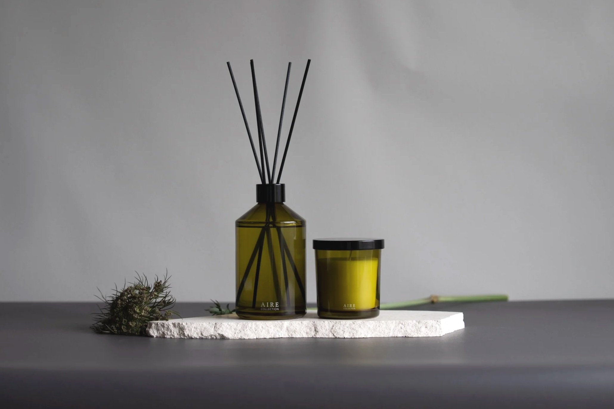
AIRE
Inspired by the quiet movement of wind, the visual language leans into calmness with a more mature, refined sensibility. Every element, from concept to execution, is designed to feel effortless; Calm and minimal, creating relaxing atmosphere at home
Brand Consulting
Contemporary Fashion Label
A brand refresh repositions an established fashion label within the Japanese market, refining its identity across both brand and digital presence. Visual and verbal elements were aligned to better resonate with local sensibilities. From website to social touchpoints, each detail was thoughtfully reviewed and restructured to ensure clarity, consistency, and cultural relevance. The result is a more unified expression, creating a brand presence that feels intentional, familiar, and seamlessly attuned to its audience.

Website Design
Social Media
Green Nation Life Japan
A cohesive art direction introduces GNL to Japan through the lens of sustainability and modern natural living. Digital touchpoints like web and social all carefully crafted to reflect the brand’s commitment to eco-conscious design. Every element is intentional and grounded, creating a presence that resonates with a lifestyle in harmony with the earth.

Localisation
Marketing Creative
Migaku
A focused ad creatives that positioned the launch of Migaku in Japan with clarity and intent. Localisation guided every choice, from copywriting to imagery, ensuring cultural resonance with Gen Z. The result was measurable: strong 5–14% CTRs well above global benchmarks, consistent engagement across multiple assets, and a standout unique CTR of 14.4%. Each ad was crafted not as chance, but as proof that thoughtful design and relevance drive performance.
Art Direction
Packaging Design
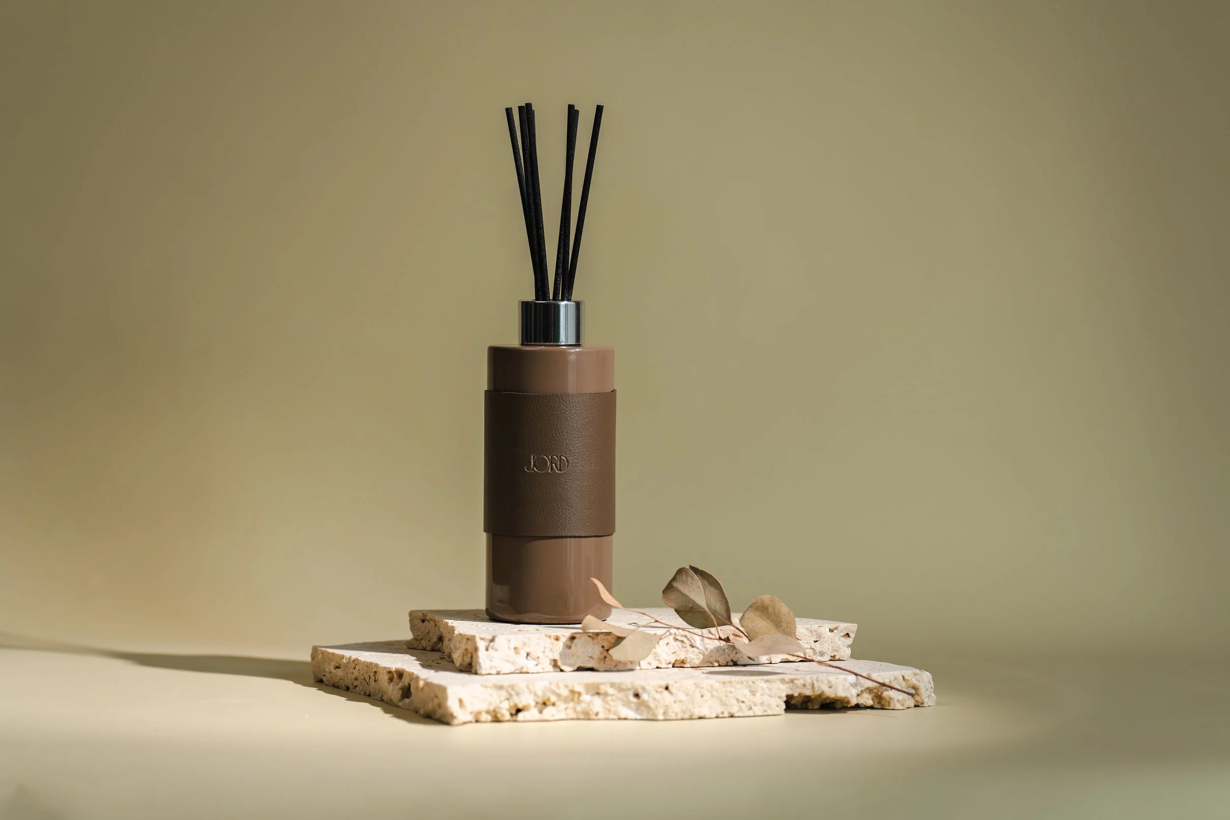
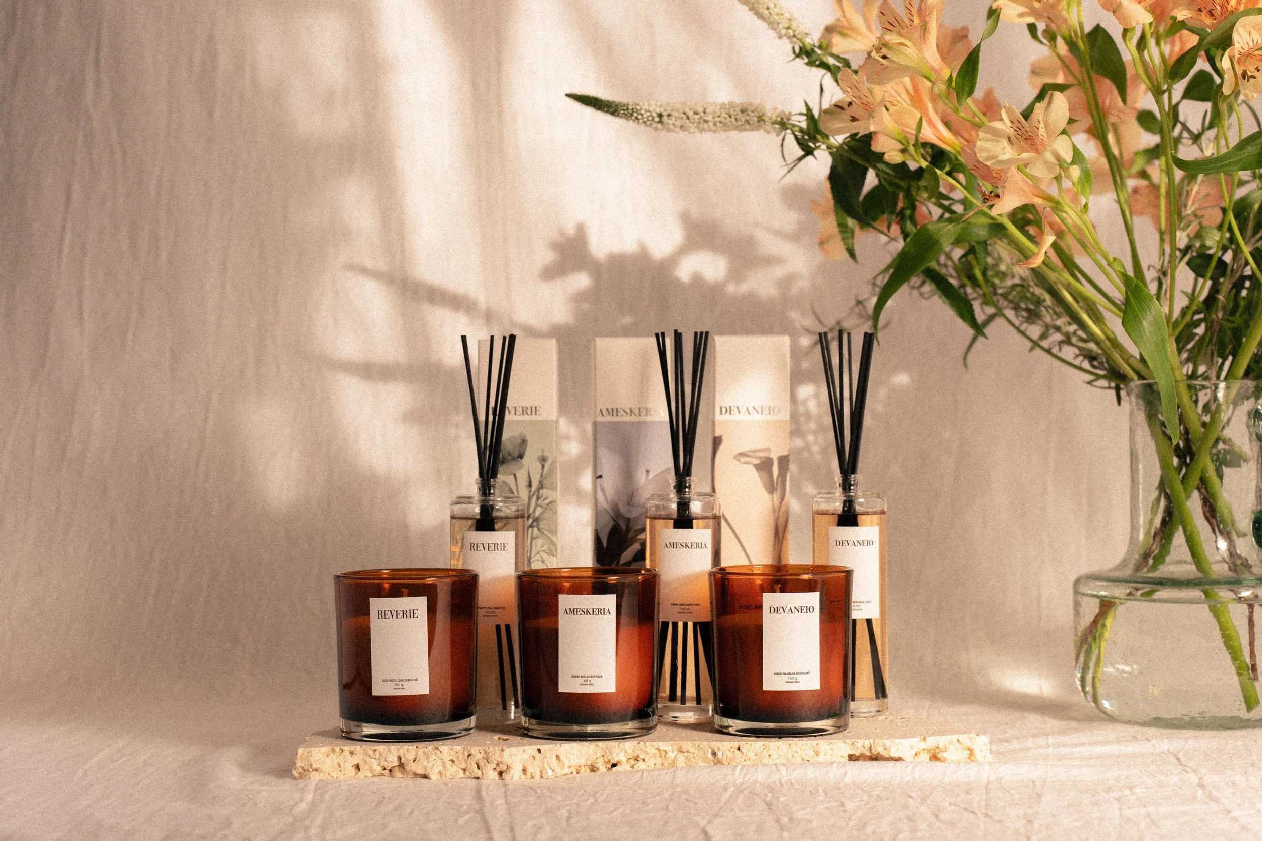
JORD
A considered art direction that frames the diffuser as both object and experience. Packaging design leans into tactile minimalism, muted tones, soft textures, and precise typography echo the calm within. Every element, from box to bottle, is designed to speak softly yet confidently.
Art Direction
Packaging Design
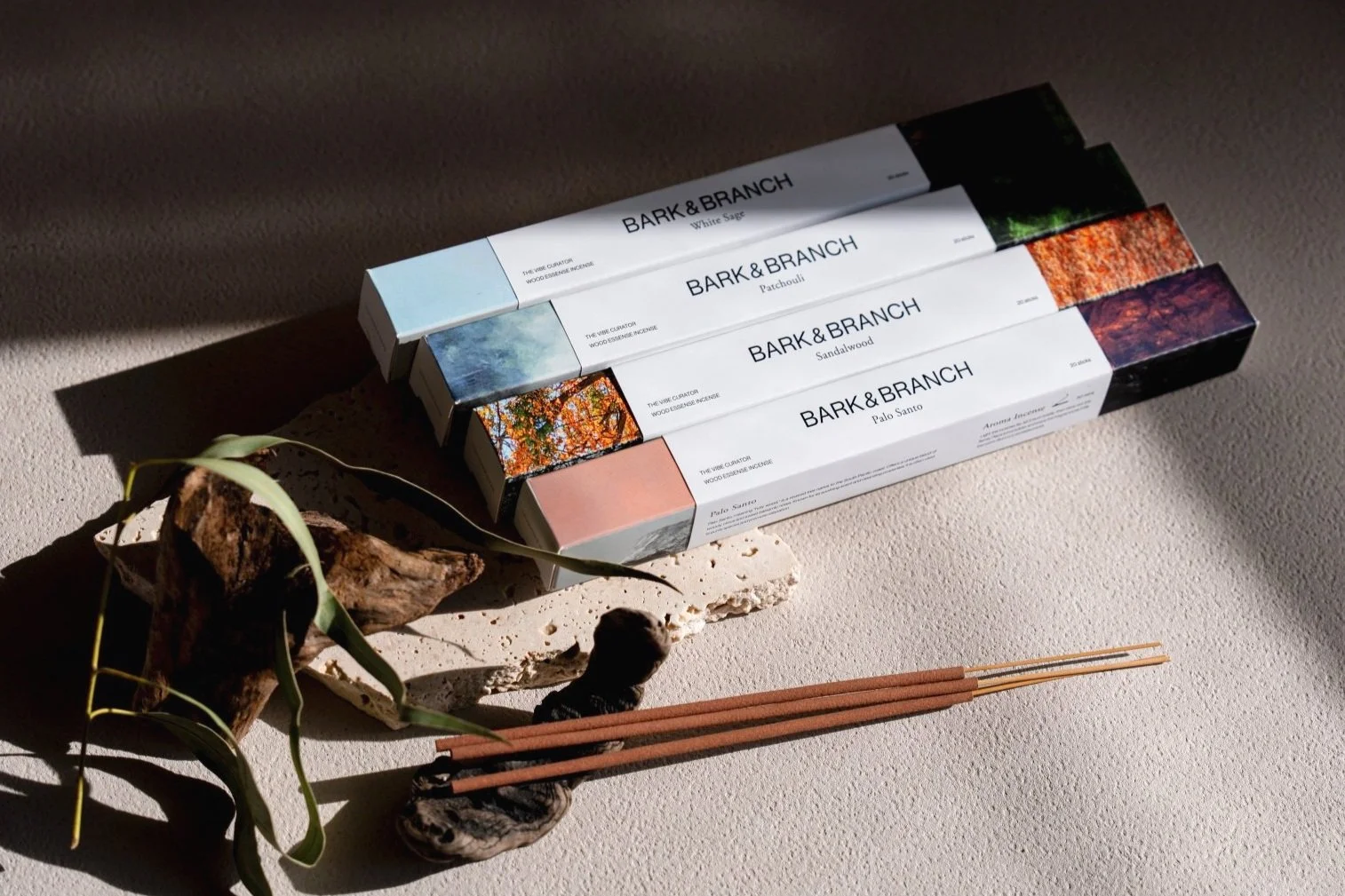
Bark & Branch
A refined art direction tailored to the Japanese market, Bark and Branch blends simplicity with a growing trend for nature and outdoor living. Packaging embraces atmospheric landscape photography with minimal type creating a balance of organic emotion and clean restraint. Designed to feel both functional and ritualistic, each piece invites a deeper connection to scent, space, and the natural world.

Personal
Freelance Venture
Social Slice
A creative collective based in Tokyo, formed to bring together independent talent under one flexible structure. Social Slice operates at the intersection of design, strategy, and storytelling where freelancers collaborate as a team to deliver thoughtful, culturally aware work. Each project is shaped by shared values, diverse perspectives, and a commitment to building meaningful brands with agility and heart.
Localisation
Website Design
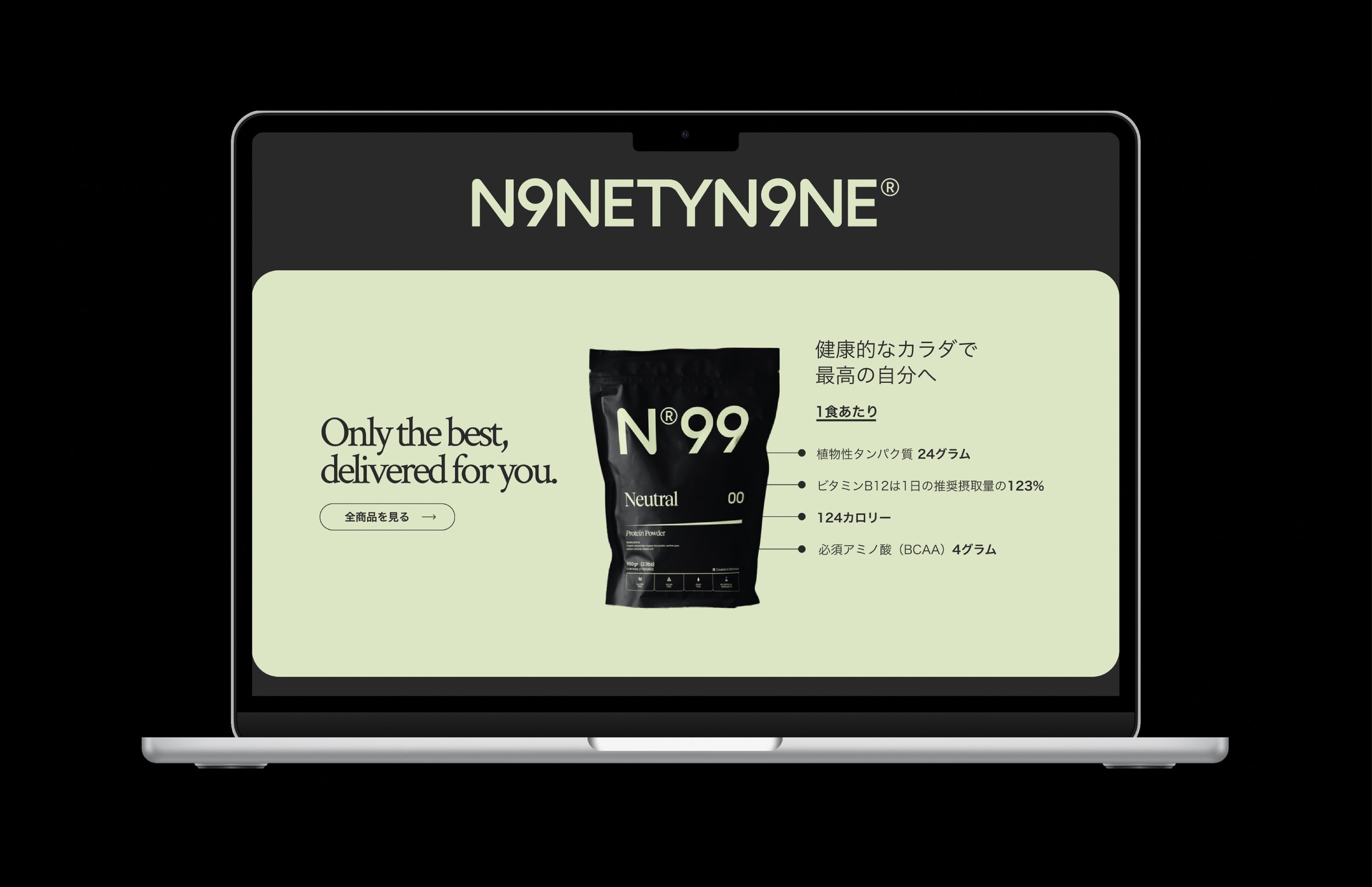
N99
A considered localisation for N99’s website, adapting content and copy to resonate with Japanese audiences. The tone was refined to reflect local sensibilities, clean, informative, and understated, while introducing vegan protein in a way that felt approachable and aligned with Japan’s wellness culture. Every detail, from phrasing to structure, was crafted to build trust and familiarity around a new category.
Art Direction
DREAMS
A soft, dreamlike art direction that captures the hazy charm of Dreams. A home fragrance designed for the Japanese feminine sensibility. The photoshoot blends pastel tones, diffused light, and delicate styling to evoke a sense of intimacy and nostalgia. The visual feels weightless and gentle, inviting young women into a world that’s both tender and quietly enchanting.
Art Direction
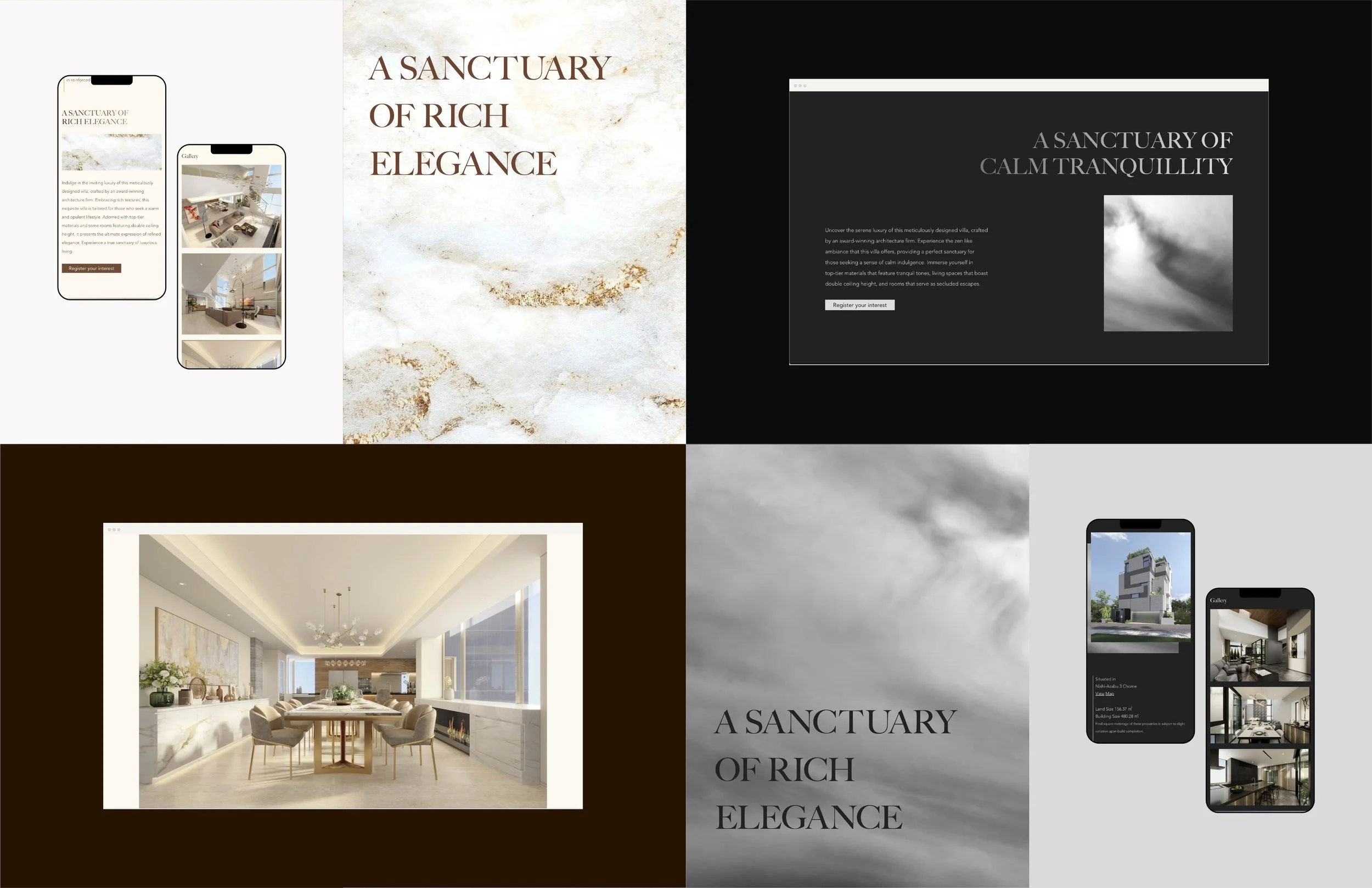
Raintree Nishiazabu
A holistic art direction crafted to position Raintree Nishiazabu as a refined residence rooted in calm and exclusivity. Two contrasting residences were communicated, each with its own identity yet united by quiet luxury. Marketing assets, copy, and visuals were designed to reflect this contrast, crafted to resonate with an international audience while grounded in the sensibility of high end Tokyo living.